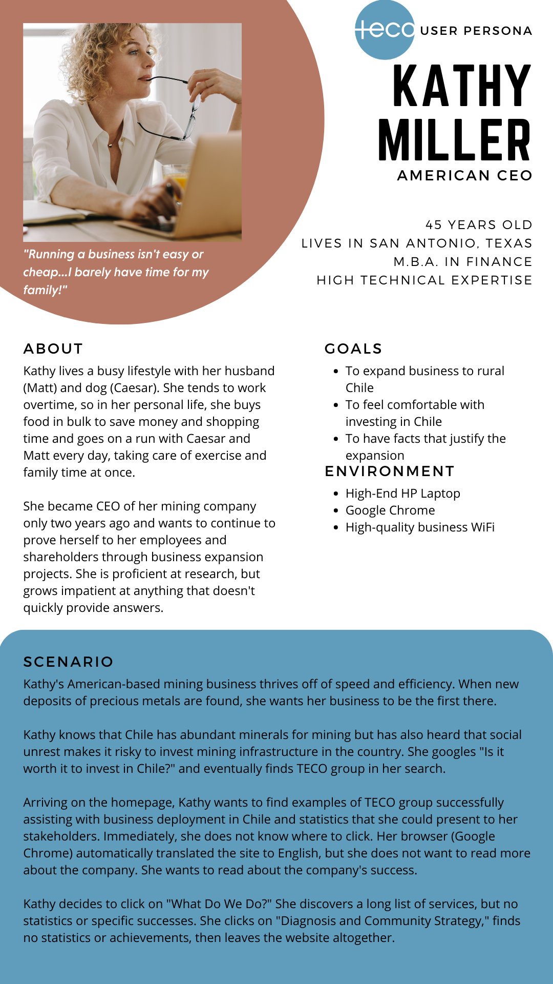
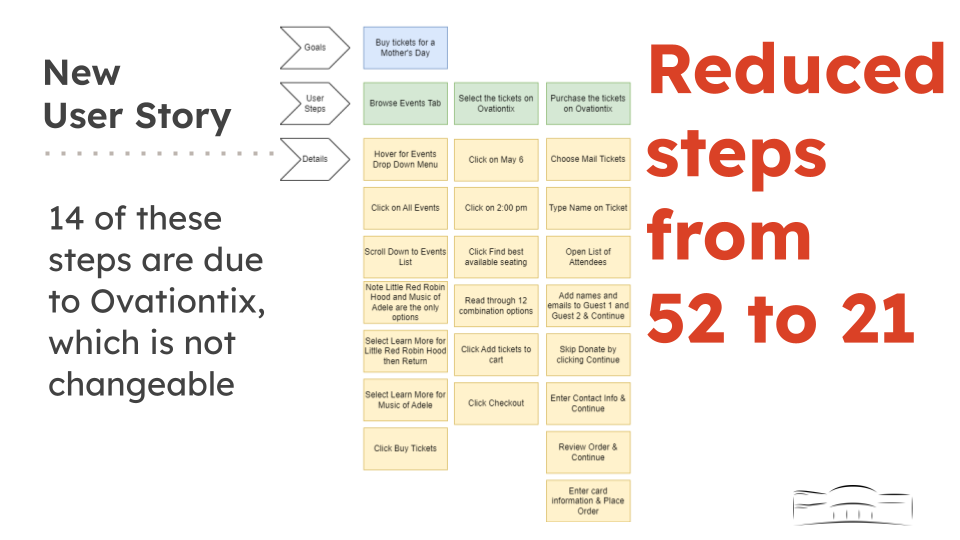
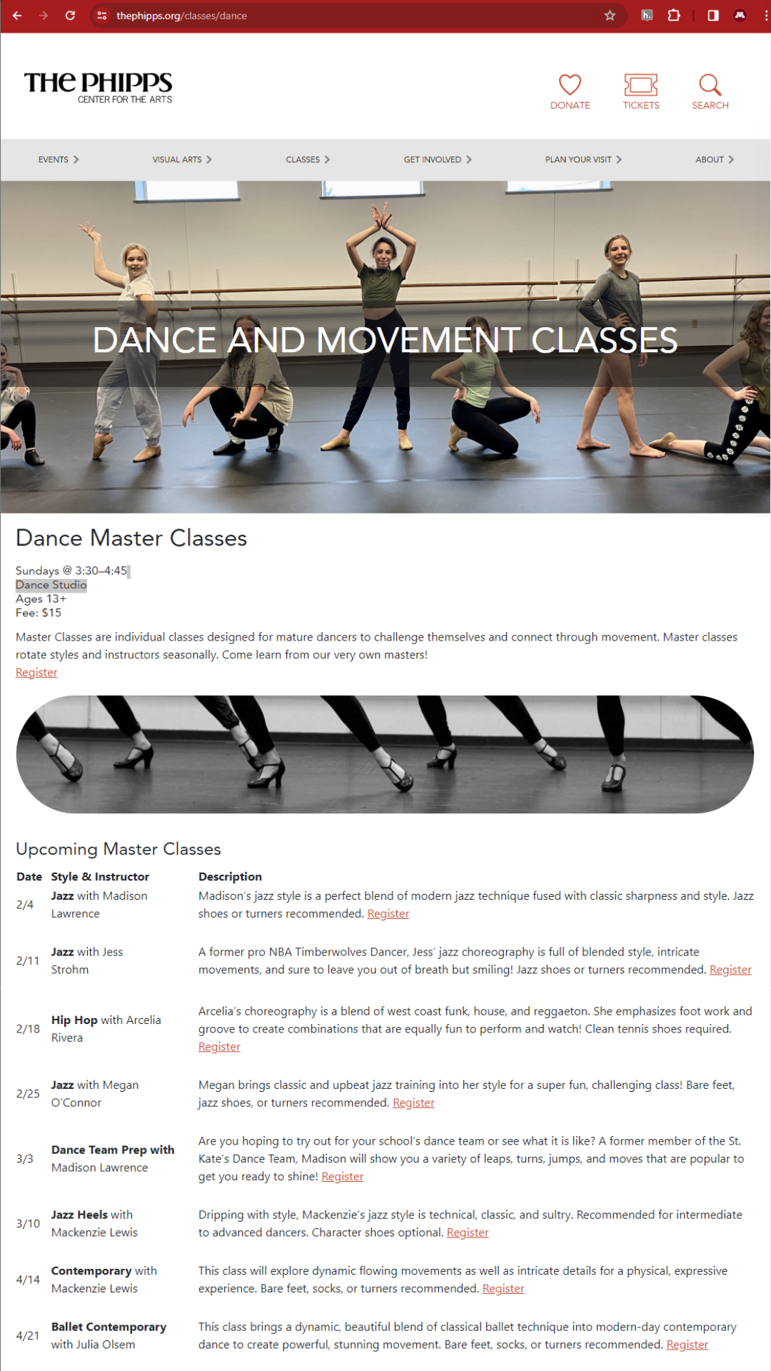
My UX Projects
From user personas to websites to maps and graphs, my motto in UX projects is “simplify, simplify.” First, simplify to make the item as simple as possible, so that someone with zero knowledge would be able to understand it. The second simplify stands for the extra mile we need to go in UX: what the production team may think is simple to a user, may not actually be. Iterative user testing is paramount! Simplify, THEN simplify!
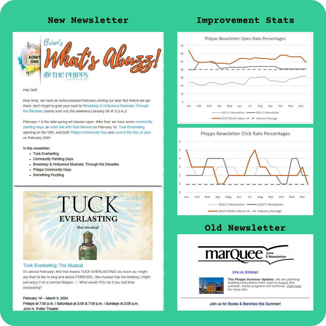
After taking over the Phipps newsletter in January 2023, I redesigned the entire look and delivery from a formal, monthly e-newsletter to the friendly, biweekly "What's Abuzz!" This improved both open and click rates dramatically, seen in the graphs below.
After redesigning this newsletter, I organized the data in these easy-to-read graphs highlighting the statistics of improvement. My redesign increased open rates by an average of 10% (which is 14% above the industry average), and click rates up 2.2% on average (2.6% above industry average).
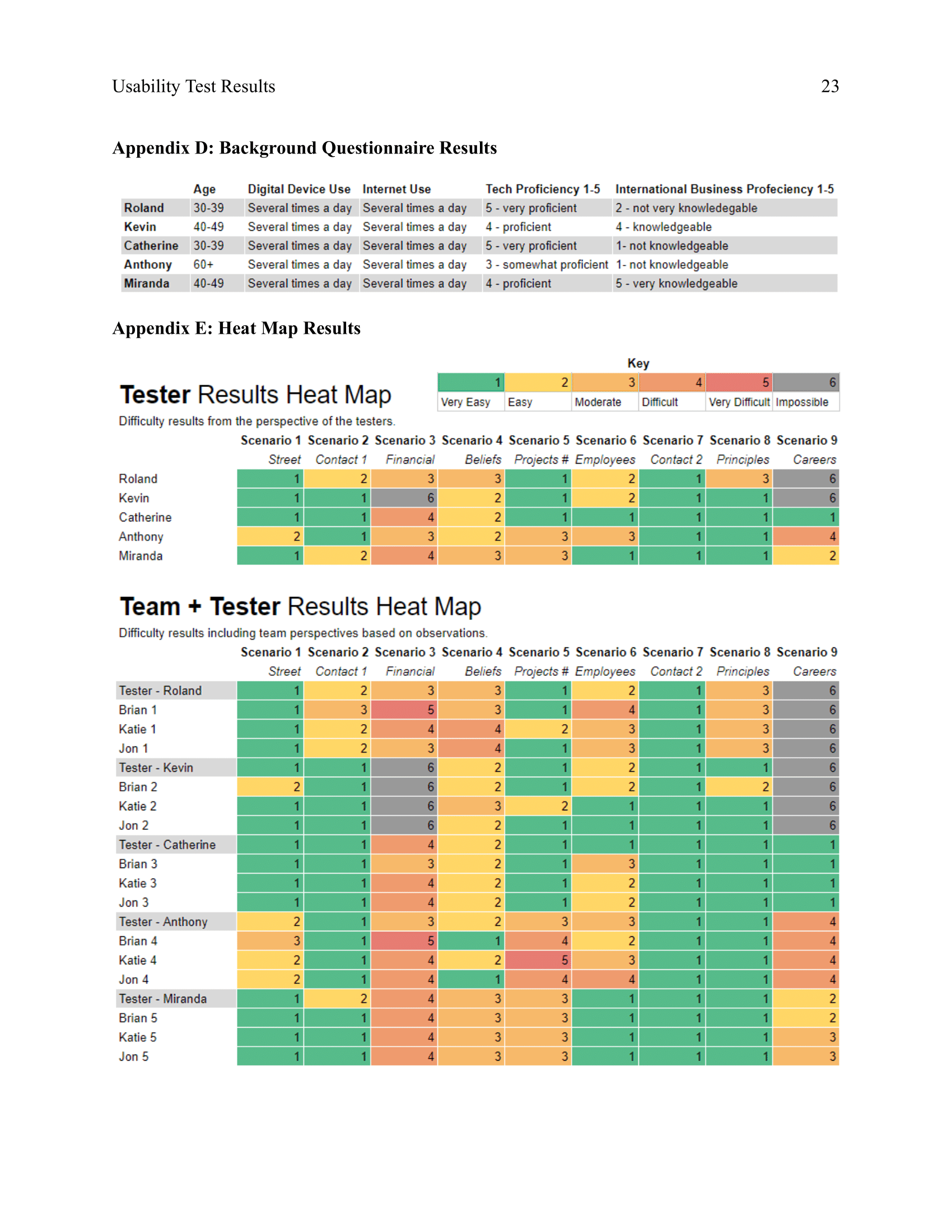
As part of my master's class on usability, I created this usability report in a team of three. The report overviews findings based on our usability tests of our client's website, TECO Group (https://tecogroup.cl/somo). Comprehensive heatmaps, images, and suggestions are included to make the site more usable.
